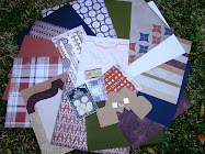
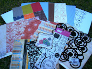
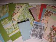
As usual, I had a blast with my kit. Here are Some things to try this month...
Try free hand cutting some scallops on the edge of your page. It doesn't have to be perfect. You don't want them to be, otherwise you would use pre-cut paper...right?
Pull out some of your old chipboard letters and use them as a template to trace and cut out your patterned paper to make letters for your title like I did with the "4" on the "July 4th outside at the Locks" page.
If you find your chipboard letters are a little to bright for the look you are going for on your page, Sand the edges of the letters to tone them down a bit. It gives a great distressed look.


1 comment:
Michelle, those pages are awesome!!!!
Post a Comment